Pretty Reels, Dangerous Games: How Visual Design Is Quietly Working Against You
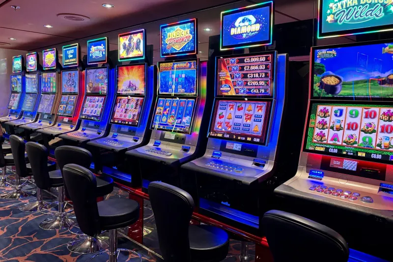
Open up any premium online pokie on your phone right now. Take a good look at it — really look. The deep jewel tones, the way coins cascade across the screen after even a modest win, the subtle glow that pulses around the reels while they're spinning. It all feels rich, immersive, almost luxurious.
That feeling is not an accident.
Every single visual element you're looking at has been deliberately chosen, tested, and refined by teams of designers whose entire job is to make you feel something specific — and to keep you feeling it long enough that you forget to check the clock.
This isn't a conspiracy theory. It's just how modern pokie design works. And once you understand what's actually happening, you'll never look at a game interface the same way again.
The Colour Code Nobody Told You About
Let's start with the most obvious tool in the designer's kit: colour.
Red and gold dominate the palette of the majority of high-performing pokies, and there's a reason that goes well beyond aesthetic preference. Red is neurologically linked to urgency and arousal — it's the same reason sale signs are red and why warning lights grab your attention instantly. Gold, meanwhile, carries deep cultural associations with wealth, reward, and success, particularly strong in Australian gaming culture where the imagery of fortune is everywhere from the pub pokie to the lottery scratch card.
When you combine these two colours in an animated, high-contrast interface, you're essentially telling your brain's reward system to stay alert. Something good might happen. Something valuable is close.
Darker, moodier games — think deep blues and purples — work differently but just as deliberately. They create a sense of immersion, almost like pulling you into a separate world where normal time rules don't apply. It's the same psychological trick casinos use with no windows and no clocks on the floor. The environment itself discourages you from leaving.
Why Animations Feel Like Rewards Even When They're Not
Here's something worth sitting with: your brain doesn't always distinguish between almost winning and actually winning at a neurological level. And pokie designers know this better than anyone.
When the reels stop and a near-miss plays out — two jackpot symbols and then a blank — many games respond with a flurry of visual activity. The reels might shake slightly. A sound effect fires. A flash of light sweeps across the screen. None of that represents a win. But your dopamine system doesn't get the memo in time.
That brief neurological spike — the one that would normally accompany a genuine reward — fires anyway. And it creates a pull to spin again, to chase the completion that felt so close.
Animations around actual wins are even more deliberate. Coin explosions, character celebrations, screen-filling light shows — these are all designed to amplify the emotional impact of a payout beyond what the dollar value alone would produce. A $2 win that triggers a 10-second animated sequence registers in your brain as more significant than a $2 win that produces nothing but a quiet credit update. The visual spectacle inflates the perceived reward.
The Layout Is a Maze You Can't See
Beyond colour and animation, the actual structure of a pokie's interface is engineered to minimise friction between you and the next spin.
Notice how the spin button is always the largest, most prominent, most accessible element on screen? Notice how the cashout or lobby button is usually smaller, tucked away, sometimes requiring an extra tap to confirm? That's not a design oversight. Every extra step between you and leaving is a deliberate barrier — because every extra step gives the game another chance to keep you.
The bet adjustment controls are similarly positioned to encourage upward movement. Increasing your bet per spin is typically one tap. Reducing it often takes more deliberate action. Over a long session, this asymmetry nudges players toward higher stakes without them ever making a conscious decision to escalate.
Autoplay features, which are now regulated or restricted in some Australian jurisdictions, were perhaps the most extreme example of friction removal. No decision required, no moment of pause between spins — just continuous play until a limit is hit or a player manually stops. The removal of that micro-decision point at each spin turn out to matter enormously.
'Premium' Feels More Rewarding — Even When It Isn't
Here's where things get a bit confronting. Research into gaming behaviour consistently shows that players rate their experience as more enjoyable — and report feeling luckier — when playing visually polished, high-production-value games compared to identical games with simpler interfaces.
The maths underneath doesn't change. The RTP is the same. The volatility is the same. But the experience feels different, and that feeling translates directly into longer sessions and higher spend.
For Aussie players used to the relatively basic interfaces of older pub pokies, the jump to a beautifully animated online game can feel like an upgrade in every sense. And in some ways it is — the entertainment value is genuinely higher. But that enhanced entertainment comes packaged with enhanced psychological engagement, and it's worth being clear-eyed about what that means for your decision-making.
What You Can Actually Do With This Information
Knowing that the design is working against you doesn't automatically protect you from it — but it does give you something to work with.
A few practical moves worth considering:
Set your session limits before you open the game. Once you're inside a well-designed interface, your ability to make clear-eyed decisions about time and money is already compromised. The limits you set in a neutral state are more reliable than the ones you try to impose mid-session.
Play with the sound off occasionally. Audio and visual elements work together to create immersion. Breaking one part of that loop — even partially — can reduce the hypnotic pull and help you stay more conscious of what you're actually doing.
Notice your reactions to near-misses. If you feel a strong pull to spin again immediately after a near-miss, that's the design working exactly as intended. Recognising the mechanism doesn't eliminate it, but it does create a small moment of awareness where a decision can live.
Try a less visually elaborate game. Simpler interfaces can actually be useful tools for checking whether you're chasing the game's content or the game's stimulus. If the appeal drops significantly when the flash is gone, that's useful information.
The Bottom Line
Online pokies are a legitimate form of entertainment, and there's nothing wrong with enjoying a well-made game. But 'well-made' in this context means something specific — it means effective at producing engagement, not necessarily fair or transparent about how that engagement is produced.
The visual design you're interacting with every session has been built by professionals who understand your neurology better than you probably do. That's not a reason to panic, but it is a reason to play with your eyes open — both literally and figuratively.
Golden spins are more fun when you're the one in control of the reel.